When Rihanna, Barbadian pop megastar and billionaire businesswoman, turned up at the Dior show in Paris last month, an onlooker called her out for being late. “No shit,” replied RiRi without missing a beat. Sending the internet into a tailspin, the singer wore a leather jacket, a sheer dress revealing a prominent pregnancy bump, and an expression that said we should all be grateful she showed up at all. And underlining her commanding air was her colour choice, or lack thereof: black.
We’re fond of a bold palette at Peachaus, you may have noticed—canyons, mountains and beautiful blooms. But before we get into that, a word on why colour has had us all captivated for centuries.
In pop culture, colour is the ultimate vehicle for meaning. Black subconsciously signals confidence and prestige and offers a protective shield—it’s something of a ‘poker face’ if you will. Rihanna channels the mood effortlessly. But there’s a whole spectrum of light to play with when it comes to choosing a colour to influence the way others perceive you or your creative manifestation and, for that matter, how you feel about yourself on any given day. This is the psychology of colour.
Director, Madrileño Pedro Almodóvar, knows more about colour than most. His expansive oeuvre, including films like All About My Mother, The Skin I Live In and the recent Parallel Mothers, is the cinematic equivalent of eating Skittles for a week—a kaleidoscope of feelings conveyed through vivid technicolour. His magnum opus, Volver, in which Penélope Cruz contends with the reincarnation of her mother, is notable for many things, not least its prolific use of red. As Penélope’s character flexes her vocal pipes (it’s not really her singing—sorry to spoil the illusion), the ruddy hue of her dress, accompanying guitarists and backdrop signal a heightening sense of emotion. And then there’s that lipstick.
And it’s no accident that colour evokes an emotional response. Its psychological power has been explored since 2000 BC. The ancient Egyptians, Greeks, Chinese and Indians practised phototherapy: the use of colour to promote healing qualities. In ancient Egypt, for example, red was a pigment that was abundant in nature, in clay, fire and blood, which lent it an association with power and passion. Green, meanwhile, symbolised new life. Many such associations persist today: just look at the BBC’s latest blockbuster documentary series The Green Planet, in which David Attenborough celebrates the wonder and vibrancy of our planet with cinematography so dazzling it might just convince people it’s worth having a few more trees around.

In India, certain shades are imbued with spiritual meaning. Saffron, the orangey-yellow hue featured on the Tiranga—the Indian flag—is considered sacred, representative of courage and selflessness. It’s also the colour worn by Indian monks. And you’ll find it everywhere in the form of beautiful marigolds—"herbs of the Sun"—symbolising creativity, passion, brightness, positivity and happiness. Blue, the colour of the Hindu deity Lord Krishna, is believed to signify immortality and bravery. Colour is so important in India, in fact, that the nation even has a festival dedicated to it. During Holi, held in late February or March, revellers shower each other in brilliantly coloured dyes to mark the arrival of spring.
Psychiatrist and dream-reader Carl Jung is generally credited as the father of modern colour study. “Colours are the mother tongue of the subconscious,” said Jung in the early 20th century, encouraging his patients to use colour during therapy, with the belief that their preferences could signify something about their deep personalities. According to Jung, introverts prefer blue, while extroverts tend towards red. He also believed that if someone likes green, they’re likely to be considerate and relaxed. A penchant for yellow, meanwhile, suggests an optimistic, sociable outlook.
For all of this research, we still don’t really know much about why yellow makes us feel optimistic, red makes us feel angry, or green makes us feel calm. And, of course, the interpretation of a colour’s meaning is subjective. We even perceive colours differently. Remember that dress?
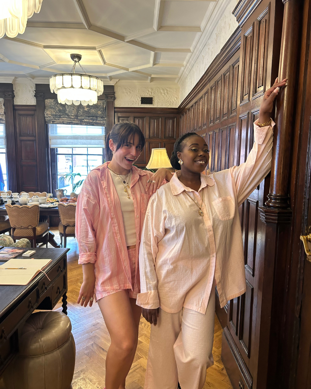
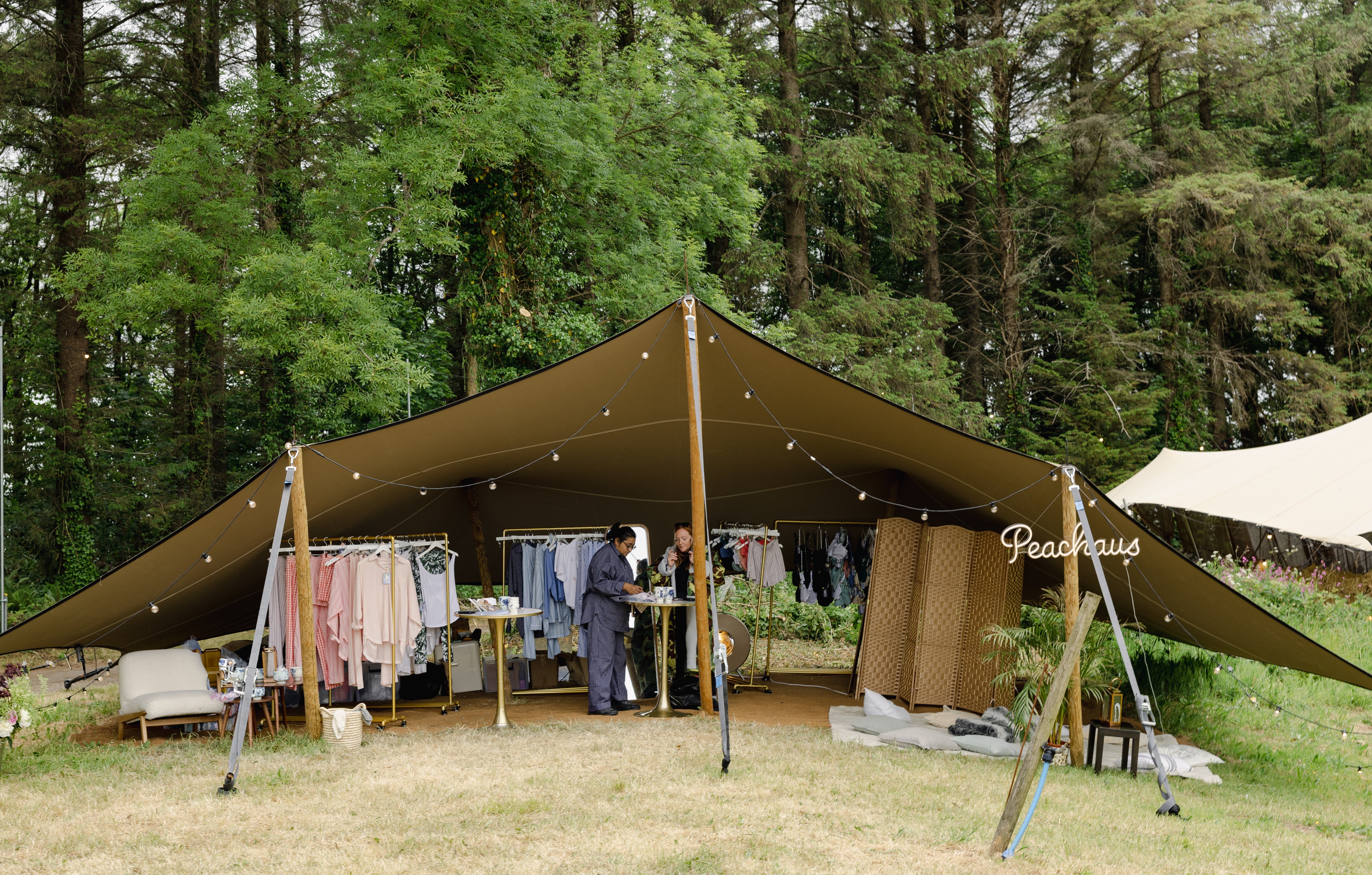
All of this brings us naturally to our bright and beautiful Peachaus palette. You’ll have noticed tones of peach threading through our website, products and social channels—a deliberately punchy choice. Consensus has it that peach brings about feelings of vitality, energy, playfulness and sociability. It’s a positive colour. But to us, it means something more, something deep and intangible.
Writer John Ruskin once said that an artist who focused purely on the shape of a peach instead of observing the complexities of its colour would never be able to accurately capture it. There’s something in this that really speaks to us. We’re a brand—a family—built on different shades and perspectives that create depth. And the colours we’ve chosen to express Peachaus are all about this richness. [Text Wrapping Break][Text Wrapping Break]Peach, with all its energy and hopefulness, is part of our DNA. Just like red is to Almodóvar’s Volver and black was to RiRi’s red carpet bump reveal. Find your perfect shade of peach and add a little pep to your step.


