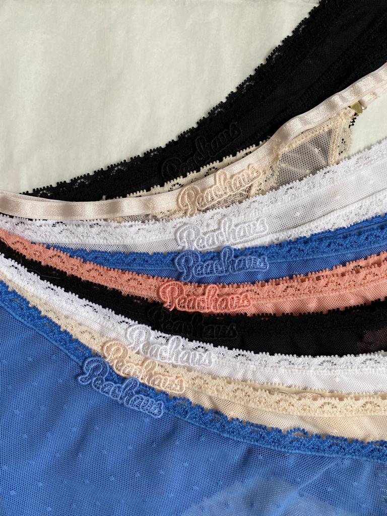
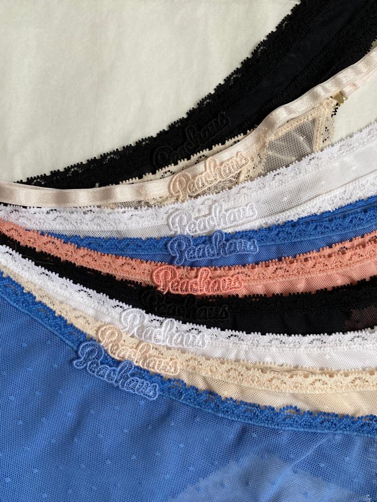
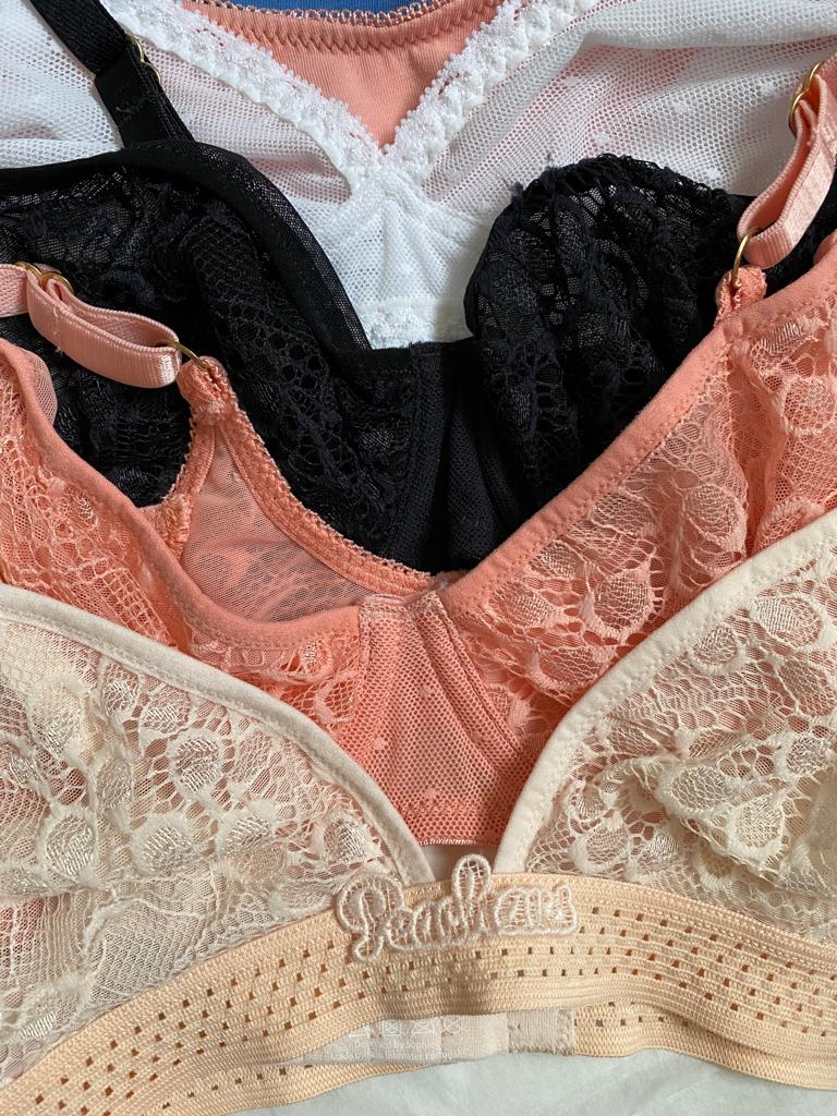
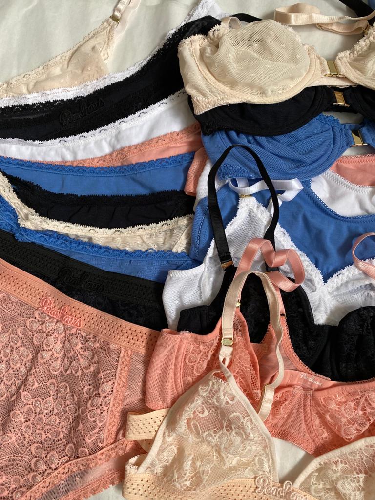
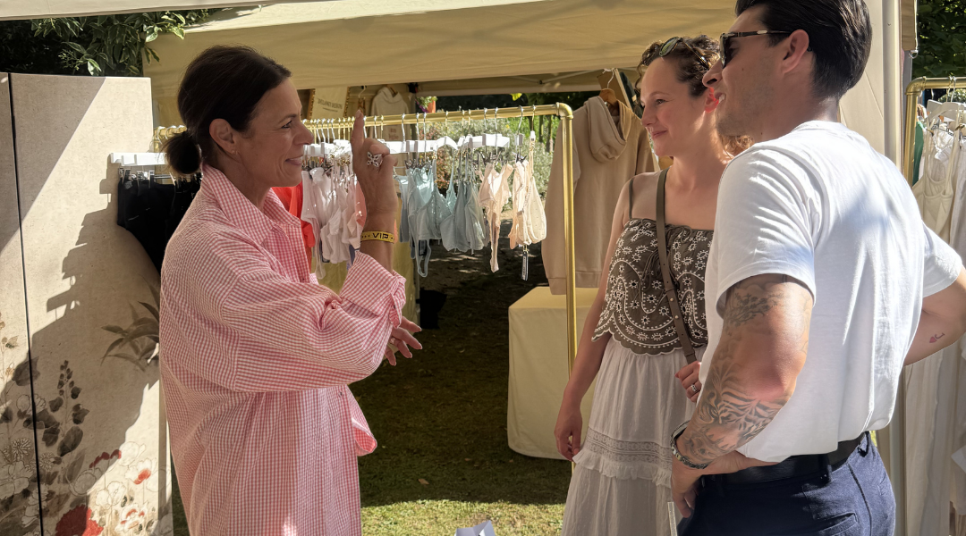
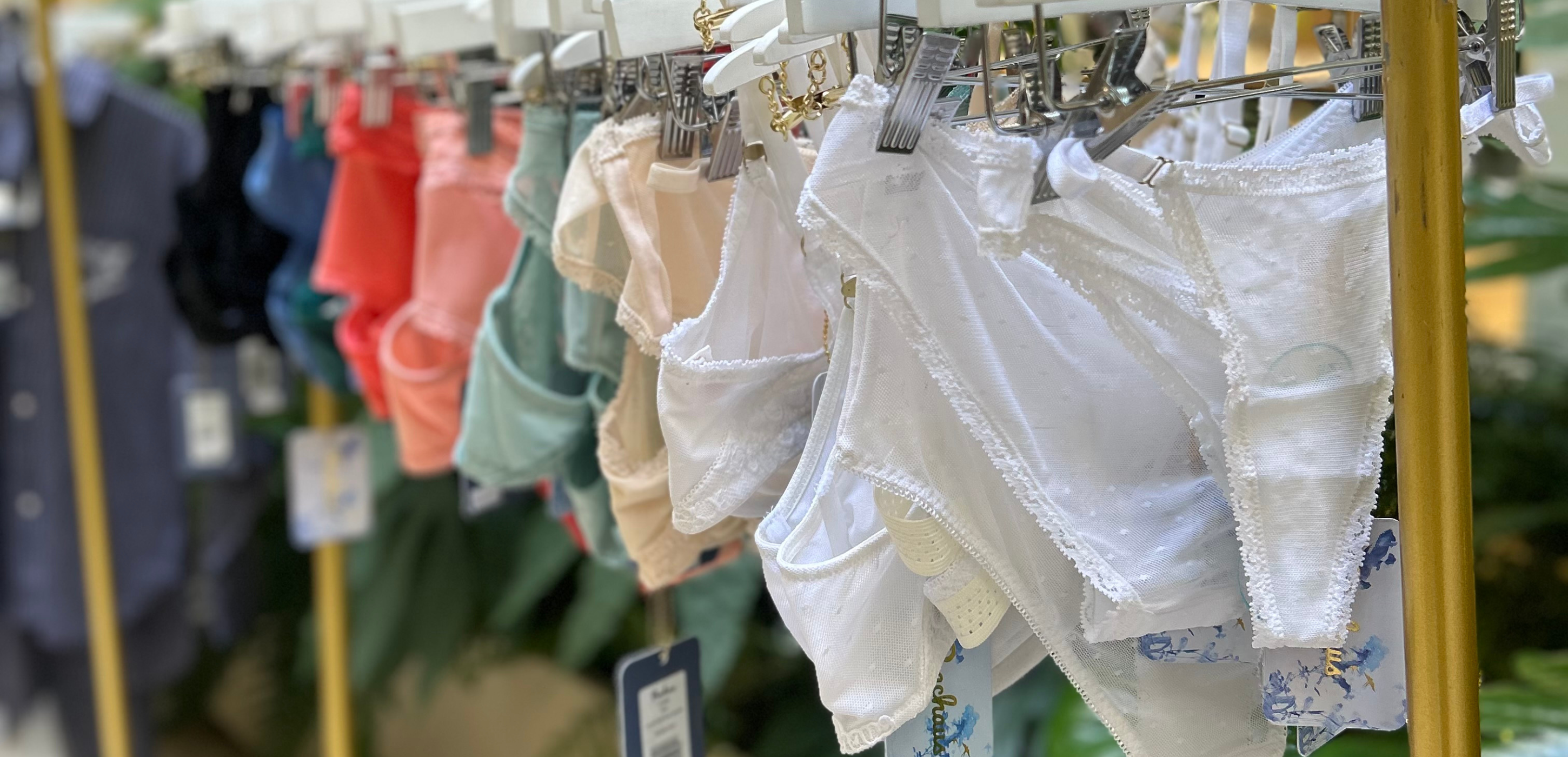
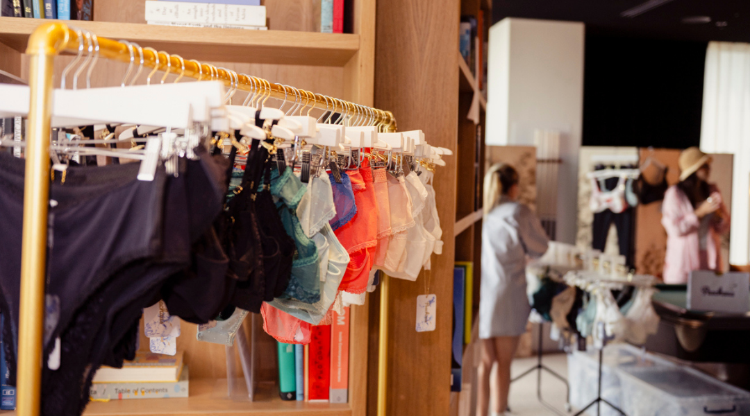
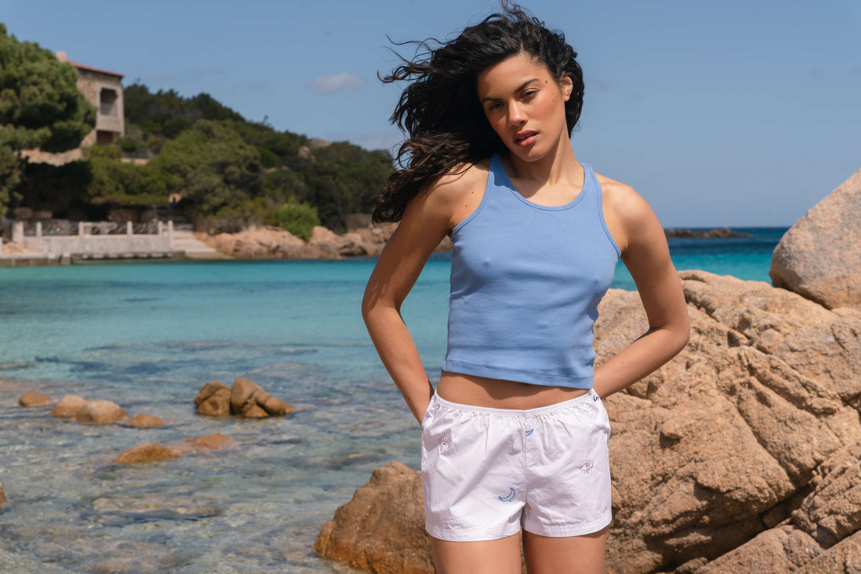
Peachaus is about positivity and creativity. Colour plays such an important role in both. Colour is emotional and carries deep meaning, on an individual and cultural level. I chose this palette because it’s optimistic, feminine and each colour is symbolic in its own way. It’s true the market has been very neutral over the last few years, especially in underwear, but we wanted to be a bit braver and more joyful.
Because the world has become increasingly uncertain. Colour is therapeutic, it lifts the spirit, and has depth of meaning. It can be healing, too.
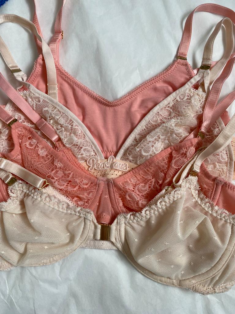
Peach is soft, feminine, warm and sensual. And it complements all skin tones, which is something that’s really important to us. We use peach blossom as a motif throughout our launch prints and branding artwork, and, of course, the peach was integral to our name.
We will be continuing to explore colour and be brave with our offer. Our palettes layer onto each other and don’t jar, which is very intentional. We don’t want anything to become dated, and we don’t follow colour trends. Instead, we choose our palettes based on what simply feels right and what excites us as a creative team.
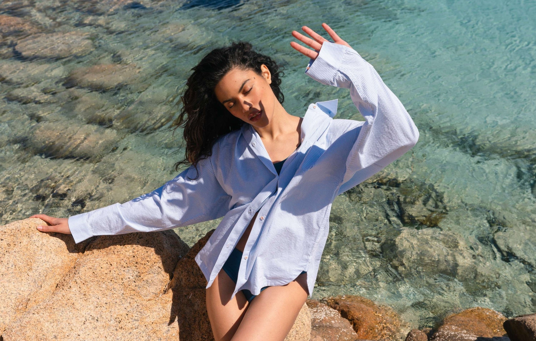
My favourite colour is any shade that falls between green and blue. Aqua, turquoise, teal; I like to surround myself in these tones. I live by the sea and there is nothing more healing and happiness-inspiring than walking along a turquoise shoreline with the sun twinkling on the surface. I’m drawn to these tones because they are calming, ethereal and uplifting. I’m not sure what that says about me, but as I’m not the calmest of people, maybe they offer me a sort of personal therapy.
-
The World I Want to Help Build
-
The Moment Everything Changed for Peachaus
-
The Hidden Women's Health Issue No One Talks About
-
Founder's Journal
Why Are Women Still Expected To Manage Their Health Quietly?
-
What Every Woman Should Know About Breast Health and Nutrition
-

Founder's Journal
The Leadership I Believe In Now


